
Case Management
(Convey365)
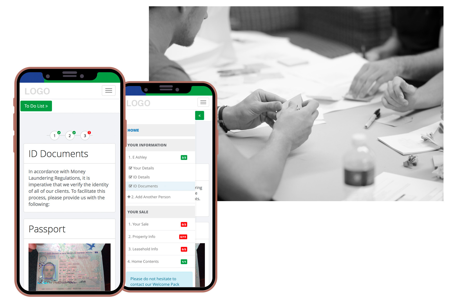
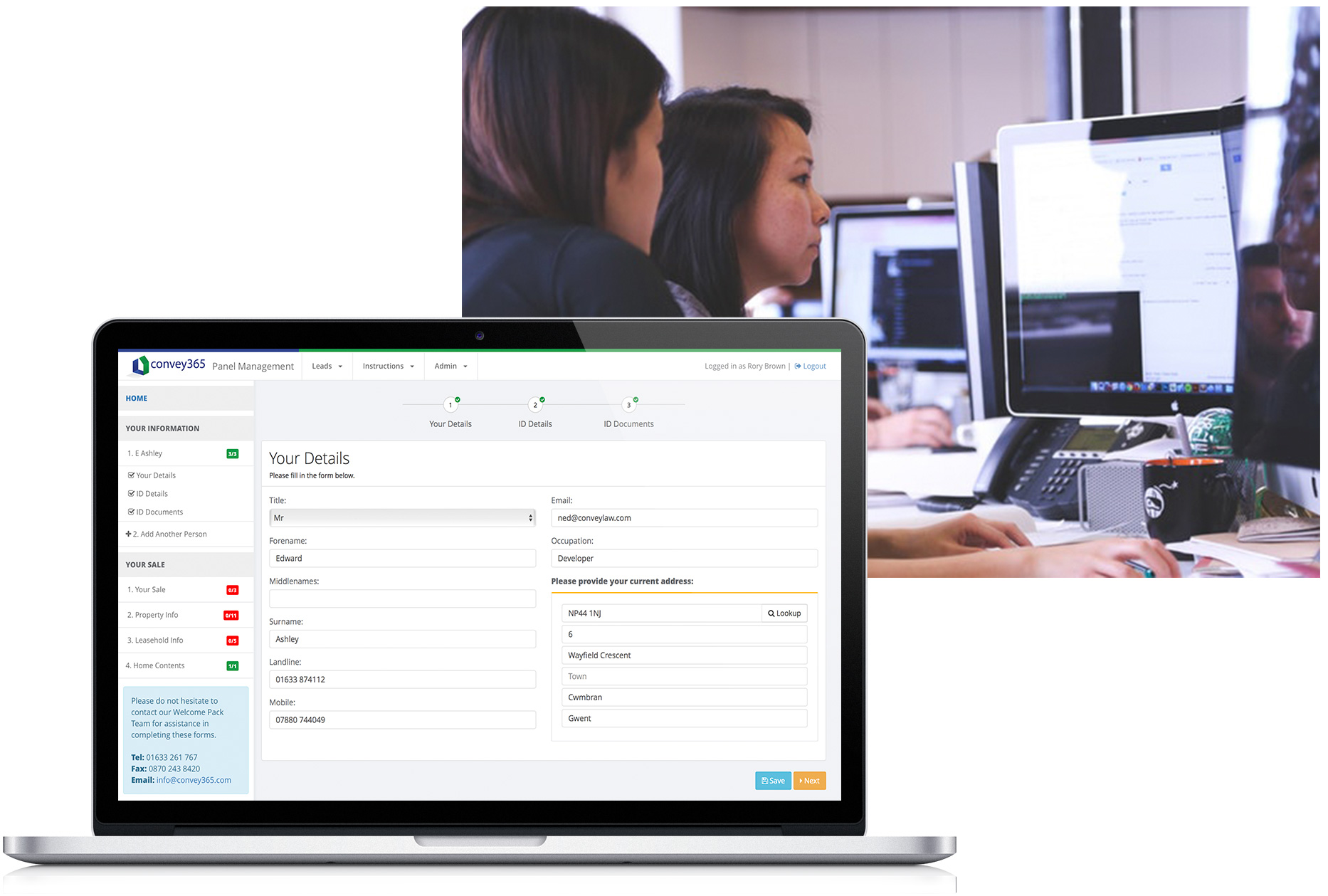
This online case-management service allows users to manage their case 24/7, via a smartphone, tablet or PC. Users can complete nearly all documentation online, verify identity, make secure payments and keep up-to-date with their case progress.
(Convey365)
The Case Management system is big, it's technically many different applications for different users all rolled into one. Below I'll briefly show the work that went into designing one of the client side application, the WP System.
The Challenge
At the moment, the majority of Property Lawyers send out paper forms requesting personal details, property information and other relevant information from clients.These paper forms can spread over eight A4 pages and contact with clients is required to verify identity and make secure payments.
The challenge is to make the client introduction and these paper forms digital. This will be an online web application available on any device with internet access.
Type: Web Application
Team: Convey365 Development Team
My Role: UX / UI Designer
UX Skills: Prototyping, Wireframing, Sketching, User Testing, Field research
UI Skills: Front End Development (HTML5, CSS3, AngularJS)
Tools: Balsamiq, Photoshop, Experience Design, Hotjar, NetBeans
Timeline
There was no set timescale for this project and the timeline we followed was simple (illustrated on the right).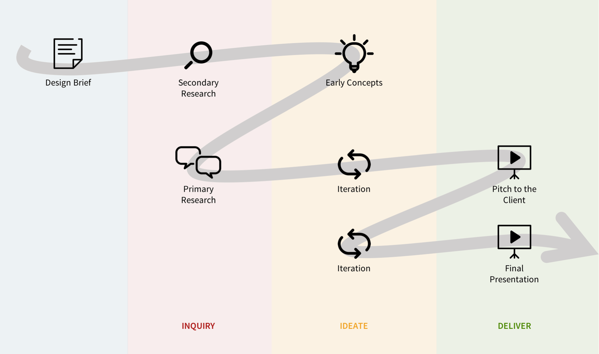
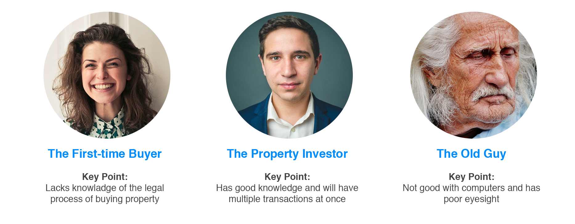
User Research
From our brief insights into personas, we identify two key points:- Users have different levels of knowledge regarding the property transaction process
- Users are not always tech-savvy
We could identify primary user needs and requirements:
- Easy navigation
- A clear step by step process
- Modern accessible design
- Clear completed task checklist
Understand Requirements
As a team, we created a list of requirements and a journey map to unify our understanding of the member experience and spot potential user painpoints. With a few back-and-forth morning brainstorming sessions we mapped out the feature prioritisation and defined our scope of work for the first build (this included checking for usability tradeoffs with developers).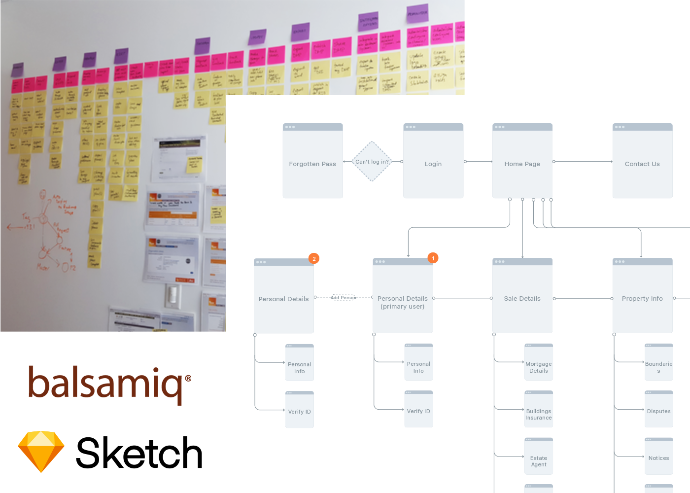
Ideation
MockupWe started ideating as soon as we had a basic understanding of the requirements, problems and constraints. During our initial design stages, I relied on simple Balsamiq mockups to gather all the fields and sections. With over 1000 different from form fields and multiple variations it's important that this stage is completed correctly.
Conceptual Design
While we came up with multiple designs we all came to the agreement on the use of a full-width dashboard design with navigation/checklist on the left and a small top navigation bar. Our key focus was on layout and simple navigation as this system needed to be rebranded for each individual law firm (simple logo change), it required a white-label design approach.
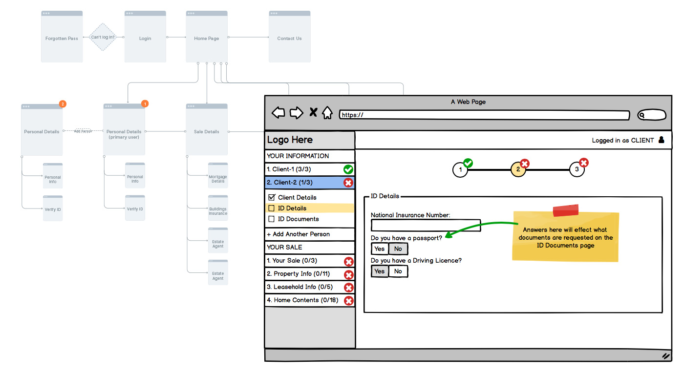
Design Iteration Example
We went through many different designs and ideas. The conceptual designs allowed us to flush our tile design which helped in the creation of the low-fidelity design. We added new features based on the feedback.One example of a feature that we looked at is the YES/NO feature. Although it seems like common sense, it wasn't the original plan. The original plan was to copy our competitors system that used checkboxes and disabled fields. Although this would work fine, we wanted a better user experience and clearer UI.
We knew we had made lots of assumptions with this feature and many other design aspect. So we wanted to validate these assumptions by talking to the stakeholders and testing it out.
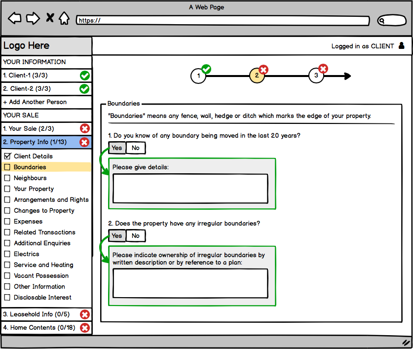
High-Fidelity Design
Before the specific design started, we presented our conceptual design test users/stakeholders and discussed the feasibility. Based on the feedback and the requirement, we designed the website with intuitive navigation, helpful functions, and modern layout.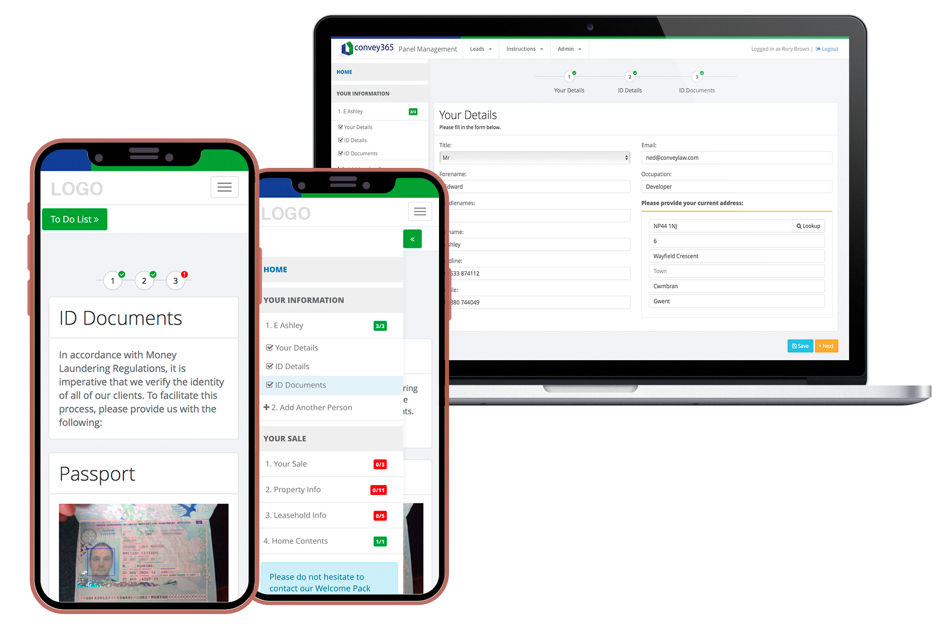
Usability Test Findings
We conducted usability testings using an interactive prototype (Low Visual/High Functional Prototype built in HTML). Participants include 4 employees and 2 stakeholders with varying background experiences. The employees varied in their job positions but all had no previous exposure to the system.What Worked
Ease of use. Overall, users liked the navigation and layout. We were able to affirm that the project was going in the right direction.
Room For Improvement
Users were confused by some of the questions and desired easier access to information. We took note and added more pop-up models with more information to some form fields to help users understand the questions better.
To Be Continued...
This is an ongoing project that I'm still working on with Convey365 to implement different guidelines. I'm still working with the product manager, developers, quality assurance engineers, and users to make sure the app is working as what we designed.Due to confidentiality agreement, I couldn't show my works online. But I’d love to share more details offline.
Retrospective
Through this project, I learned the importance of team work and how to efficiently operate as a team. It can be a challenge to have everyone in agreement, when we all have different thought processes. Fortunately, my team members were great listeners and collaborators. We were able to question each other’s ideas when we didn’t understand, and come together in a way that would improve on the initial idea. We always made sure everyone was in agreement before moving on to next steps. This way we eliminated unwanted surprises and kept the project moving along in a timely manner.

Want More?
Contact Me
Mobile: (+44) 7866672293
Contact Me
Email: contact@roryokeefe.co.uk
Copyright Rory O'keefe ©